[Post Number 16]
The distribution of films is critical to the success of it with consumption by audiences. Through commercials and social media this is possible. However, print is also significant to the advertisement of its release. Billboards and posters are often used. This print media is a source of inspiration for my project on print media. Through posters, the importance of powerful pictures is shown that is comparable to the cover of a magazine. Thus, analyzing popular films that have made major revenue in the box office is useful to understanding how to create a powerful magazine.

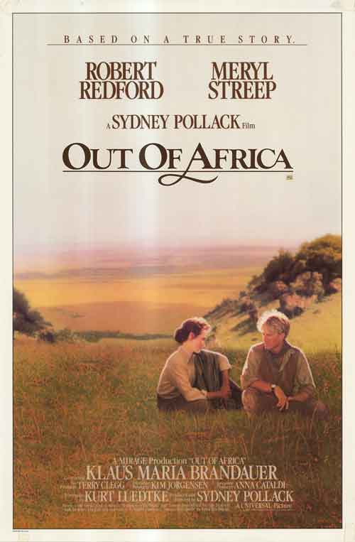
The poster made for Out of Africa speaks to the excellent cinematography in the majestic scenery. Art through camera movement was transferred to the poster with the background of nature and off-center focus on the two characters sitting in the grass. The font of the writing on the poster further shows the calming and reminiscent feel of the film. The brown coloring indicates the earthy tone and the curvy lettering is soft. The movie is targeted more towards women in this way, especially with the romantic story-line. Indicating the movie is “based on a true story” on top headline is meant to intrigue audiences. The meaning of the film resonates with them since it is somewhat true. Other important aspects of this poster to consider are the mentioning of star actors on the top, in large lettering. The lead actors’ names are practically as large as the title itself, showing how critical they are to the film and trying to attract viewers to watch the movie based on the fact that those actors are in the film. At the bottom of the poster, small lettering indicates producers and collaborators on the film, allowing it to appear credible.

The distribution of the the film Blade Runner 2049 involved creating a futuristic representation. The title on its own suggests the time is in the future. The font is is red, orange, and yellow flares, depicting a fire-like look. This implies the world is falling apart or burning down. On its own, the font creates a modern look by containing straight lines and harsh edges. It looks fierce, especially, with the flames. The names of the leading actors lie over the main title on the bottom, including Ryan Gosling and Harrison Ford. Emphasizing these already well-known actors increases the film’s credibility and potential. Harrison Ford is also well associated with the genre of sci-fi/fantasy films, since he became famous from the Star Wars series. The background of the poster further creates an attention-drawing look. There is a division in color separated by the actors. On the left, the burning fire look in red is seen – the area by which Ryan Gosling is and where the bottom man is turning towards. This association can allow viewers to assume there is some sort of connection between that side and Gosling, as well as the suspicious-looking man. Towards the left, there is a vibrant blue with what seems to be spaceships flying over buildings and releasing blue light and a sort of gas. This is possibly the safer side of the futuristic world, where life is possible. Ford is tied to this side, as well as the woman centered by his side. It is important to note that Ford and the woman are staring directly towards the audience, representing them as the characters which are significant to the story. Furthermore, it allows viewers to sympathize with them, showing they are likely the protagonists.